
Design & Craft, From Park Street
What “deft” means, and why we hid it in our logo
Every logo needs a small version that still works. Ours got a name. The story of the compact mark inside our new identity.
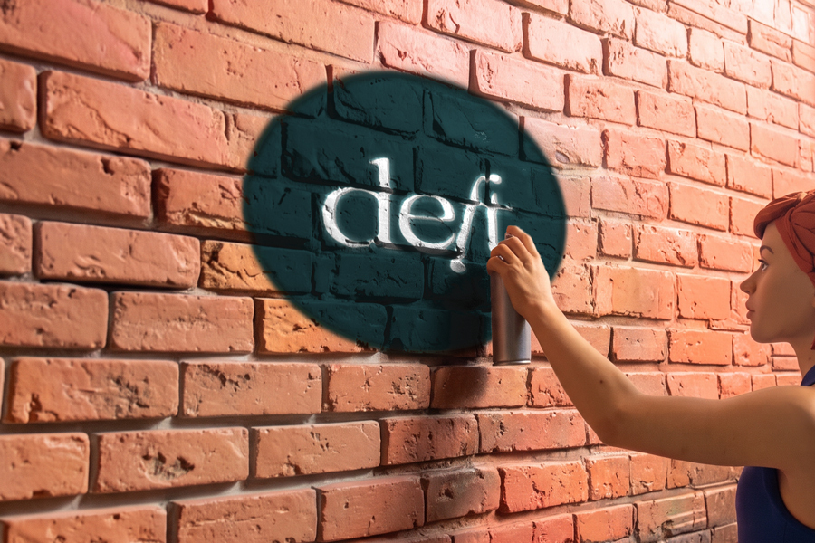
Most logos need a compact version—the little square that fits an app icon, a profile photo, a stamp on the corner of a page. The lazy common way to make one is to grab your initials and call it done. We wanted ours to actually say something.
So we looked at our own name for a word worth keeping. Take the de from design and the ft from craft , and you get deft , which, conveniently, is a real word that means skillful, neat, and quick. It’s the quality we’re chasing on every project: not just good, but good and unfussy, handled with a light touch. A mark that means “skillful and quick” is a lot more useful than one that just means “our initials.”
This is the part of branding that’s easy to skip and expensive to skip. The typeface, the color, and the spacing gets all the attention, but the idea underneath is what makes a mark stick. People remember meaning.
There’s a small lesson in it for anyone building a brand: before you design the mark, find the idea. Look for the word, the double meaning, the small bit of wordplay that’s true to what you do. You won’t always find one—and you shouldn’t force a bad pun just to have a story—but when the language is already sitting inside your own name, it’s worth the afternoon it takes to notice.
The best part is that “deft” now sets a bar for us. It’s a little uncomfortable, in a good way, to put a word like that on our door. It means the work has to earn it. Which is exactly what a brand is supposed to do: make a promise specific enough that you have to keep it.